X Journal

A Student-Run Visual Arts Publication
Year 2017–2020
Kind
  • Editorial Design
  • Web Design
  • Graphic Design
  • Project Management
Tools
  • Adobe InDesign
  • Adobe Photoshop
  • Adobe Lightroom
  • HTML/CSS
  • Vue
  • Tachyons
  • Netlify
Collaborators
  • Evan Economos
  • Odessa Sagli
  • Arthur Santoro
  • Nola Thompson
  • Kyle Yang
  • Sidath Wanigasinghe
  • Tim Stedman
Website
 

X Journal is a student-run college publication that documents and publishes student artwork. I helped start it in 2017 and helped lead it from 2018-2020.
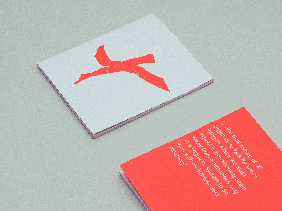
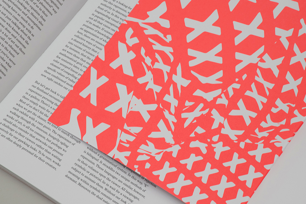
A book faces up with a bright orange distorted letter. Another copy of the book faces down and is fluorescent orange with a quote in white.
Cover of issue 1, 2018. Printed with fluorescent orange on uncoated paper.
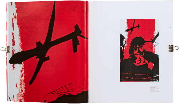
An open book. The right page features an image of a screenprinted artwork and the left page shows a detail of the artwork.
Example spread from issue 1. Artwork by Haider Khan.

Layouts were kept stark in order to focus attention on images. Pages are activated with asymmetric composition and intentional use of white space. All work featured in the journal is given space to breathe and resonate.
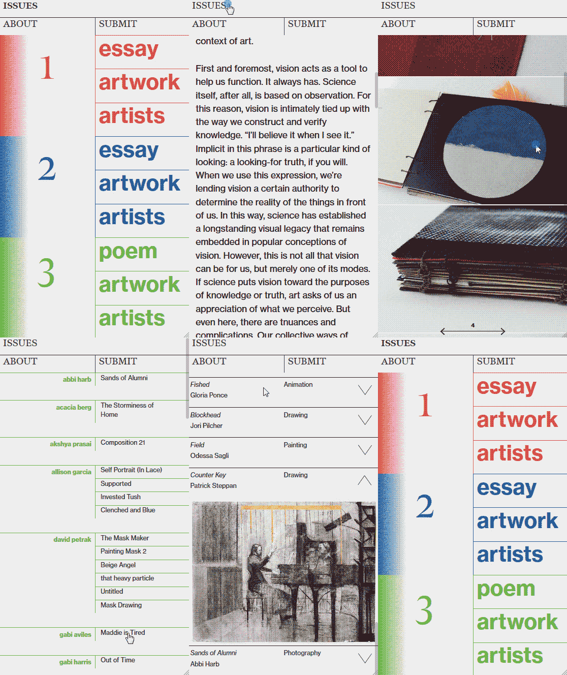
An animated image that shows different parts of the website including an essay, .
The site's design echoes those of the physical issue. Non-distracting, stark, and easy to navigate.

After a successful first issue, the organization's budget doubled through the college budgeting process. The college's admissions department used the books for speaking with prospective students interested Knox's art program. The money from these sources allowed the second issue to be printed in higher quantity and with better paper.

Two floating books. One has a cover prominently featuring a vaporous and fragmented metallic letter X. In the other a metallic, distorted, fabric-like graphic is printed across the entire inside.
My design for the issue 2 cover. Mockup made with xerox, mirrors, and Blender.

Our work on issue 2 was focused around abstraction and distortion. Making this journal is a learning process, and I had the opportunity to pursue many lines of visual research during it's production.
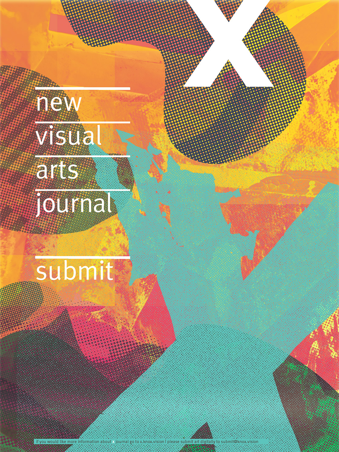
A graphic, colorful, and bold poster reading 'new visual arts journal. submit'.
One of three posters made to advertise our submission drive the first year.

We set out to make graphic materials that would reference the visual language of artists at Knox at the time.
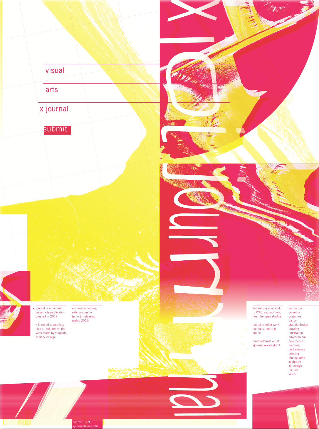
A new-wavey yellow and magenta poster detailing the submission process.
Submission drive poster for our second year.

X's third issue (and my last) was never printed due to complications with COVID-19, however we did an online publication in hopes of giving students an outlet to share their work. Issue 3.
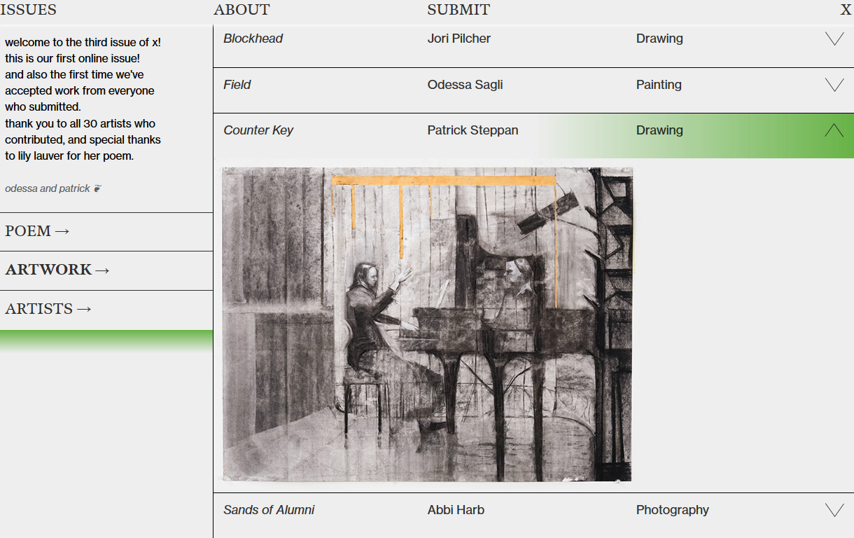
An image of X Journal's website, which is featuring issue 3. It looks simple and understated.
Issue 3's online layout is different, because it has no physical counterpart to speak with.